What is Responsive Web Design and Why is it Essential?
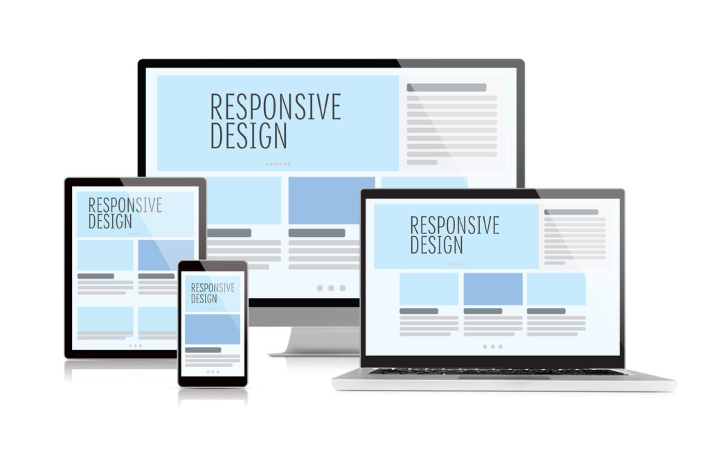
Responsive Web Design is an approach to web development that aims to create websites that provide an optimal viewing experience across a wide range of devices. This means that a website should seamlessly adapt its layout, images, and functionality to fit the screen size, whether it's a desktop, tablet, or smartphone. By utilizing flexible grids, responsive images, and CSS media queries, sites can ensure that their content is easily navigable and visually appealing no matter the device being used.
Implementing Responsive Web Design is essential for several reasons. First, with the increasing use of mobile devices to access the internet, having a site that is mobile-friendly is critical for user satisfaction and retention. Additionally, search engines like Google prioritize mobile-friendly sites in their rankings; thus, responsive design can improve your SEO performance. Lastly, a consistent user experience across all devices builds trust and enhances brand credibility, making it a vital component of modern web development.
10 Best Practices for Implementing Responsive Web Design
Responsive web design (RWD) is essential for creating a seamless user experience across various devices. Here are 10 best practices to consider when implementing RWD:
- Start with a mobile-first approach, designing for smaller screens before scaling up.
- Utilize flexible grid layouts that adapt to different screen sizes.
- Employ scalable images that retain quality on larger displays without affecting load times.
- Incorporate media queries in your CSS to apply styles based on device characteristics.
- Optimize navigation by using dropdown menus or off-canvas designs that are easy to use on touch devices.
Additionally, to enhance your responsive web design, focus on performance and user engagement:
- Minimize HTTP requests by reducing the number of assets loaded on your website.
- Leverage browser caching to improve loading speeds for returning visitors.
- Test your website on various devices and screen resolutions to ensure a consistent experience.
- Use vector graphics such as SVG for logos and icons for clear scalability.
- Regularly update your design based on user feedback and emerging trends in responsive design.
How Responsive Web Design Improves User Experience Across Devices
Responsive web design is a design philosophy that allows websites to adapt seamlessly to various screen sizes and orientations, enhancing the overall user experience. As more people access the internet through smartphones, tablets, and other devices, having a responsive design becomes crucial. It ensures that content is easily readable and navigable no matter the device used, eliminating the frustration that comes with excessive zooming or scrolling. In fact, studies show that users are more likely to stay on a site that is well-optimized for their device, leading to lower bounce rates and higher engagement.
Moreover, a well-implemented responsive web design also contributes to improved loading times and better usability, which significantly impacts user retention. By employing flexible grids, images, and CSS media queries, websites can load only the necessary elements for the user's device, resulting in faster performance. This speed is essential, as research indicates that even a one-second delay in loading time can lead to a substantial drop in conversions. Overall, prioritizing responsive design not only enhances user satisfaction but also boosts a site's search engine ranking, making it an invaluable investment for any website owner.